
Brand Identity Coursework
I created this piece for my continuing education class called Brand Identity last semester. The assignment was to imagine a new brand identity for the Brooklyn Botantic Garden. One of the challeges I found with this project was that I really think the current brand for the BBG is really strong and quite fully realized. So what decided to do was make something that was, at least to me, a very different direction. I also wanted to push myself outside of my normal parameters with this class. I normally do a lot of design work that is very geometric and inorganic, so I attempted here to do something as organic as I could while still having a mature aesthetic.

The Logo
The logo was the most difficult part of this project for me for a number of reasons. Because I was going in an organic direction I wanted to do something less generic than just a single flower, because I've seen that for tons of botanic garden logos (not that that's a bad thing). I wanted something that was lush and bursting out, represented the diversity of the garden, while being contrasted by the geometry of the dome. The problem with doing that is it made the logo sprawling and unweildy which made it difficult to place the text without making the logo a huge beast that wouldn't fit well on a page or reduce well. I should mention here that part of the assignment was to have an image and a wordmark that were specifically not combined. This is part of what made keeping the size under control challenging. I made some compromises, but I'm reasonably happy with the decisions I made to strike that balance.

I very quickly realized that it would be a lot of fun and give the various brand materials a lot of energy if I really took advantage of the logo illustrations and used it as a pattern and super graphics wherever it felt appropriate. I had seen super graphics used before but not really thought about using them until they were explored in this class.

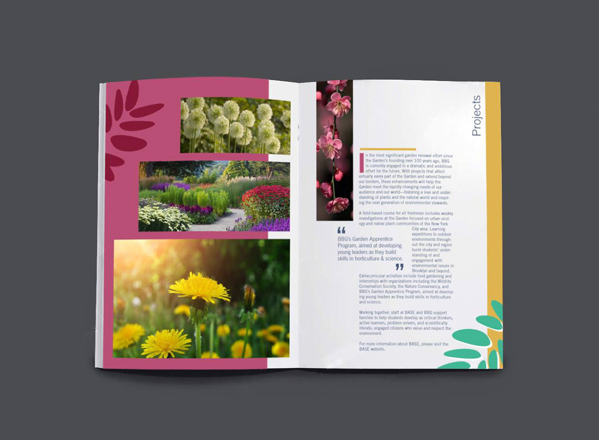

Above is a good example of me trying out super graphics. I also thought it was cool to continue breaking out the various components of the logo to fill out visual elements for the brand system as I did with the dome above.


